Build a performant autocomplete using Phoenix LiveView and Alpine.js
One would think creating an autocomplete (or typeahead) field is something which has been solved a bazillion times before. And yes, there are a ton of tutorials out there for React, Vue, Angular or any other modern frontend frameworks. Also, there are a few handling this in Phoenix LiveView like:
- Interactive, Real-Time Apps by the creator of Phoenix himself Chris McCord.
- And even in the official phoenix_live_view_example repo.
Probably there are even more, but all examples I found so far use the HTML datalist element. It’s widely supported and is nice for simple use cases, but as soon as you like to style it somehow to display additional contextual data (e.g. images) you will have a hard time.
Therefore we are going to build our own autocomplete now. Our autocomplete will provide an item search for items from some kind of game item database. We use Phonix LiveView and utilise Alpine.js to avoid unnecessary round-trips to the server. This will provide a better overall UX and makes the autocomplete snappier.
That’s how the final result does look like. Best thing is, that the whole solution is only around 140 LOC (that’s great, isn’t it?).
If you are in a rush, you can also directly grab the full code from GitHub.
Let’s build it (finally).
I expect you to know how to setup a new Phoenix LiveView project, so I won’t guide you through that. But we have to do some nifty setup before we can actually start hacking.
Alpine.js is a JavaScript dependency which we will need to handle some client-side stuff where no server round-trip is needed. So let’s install that first.
# in your phoenix project dir

cd assets
yarn add alpinejs
To make Phoenix work nicely together with Alpine.js, one more thing is needed. Import Alpine.js and make sure that it can keep track of the DOM Elements, even if Phoenix LiveView does move them around. Head over to your assets/js/app.js
and add the following:
import 'alpinejs';

// ...

let liveSocket = new LiveSocket('/live', Socket, {
  dom: {
    // make LiveView work nicely with alpinejs
    onBeforeElUpdated(from, to) {
      if (from.__x) {
        window.Alpine.clone(from.__x, to);
      }
    },
  },
  params: {
    _csrf_token: csrfToken,
  },
});

// ... some more code
Create something useful.
Now that we have the setup stuff out of our mind, let’s create a module which will serve as our tiny item database. Put this into lib/autocomplete/items.ex
defmodule Autocomplete.Items do
  @items [
    %{id: 1, name: "Item 1", image_url: "images/items/1.png"},
    %{id: 2, name: "Item 2", image_url: "images/items/2.png"},
    %{id: 3, name: "Item 3", image_url: "images/items/3.png"},
    %{id: 4, name: "Item 4", image_url: "images/items/4.png"}
  ]

  def list_items() do
    @items
  end

  def get_item(id) do
    Enum.find(@items, &(&1.id === String.to_integer(id)))
  end
end
Now we have a tiny item database where we can fetch either all the items or a single item.
Create a LiveView module and a leex template for the actual autocomplete. I like separating the template from the actual business logic here, but you could certainly add the HTML to the render function inside the LiveView module.
lib/autocomplete_web/live/item_search_live.ex and lib/autocomplete_web/live_item_search_live.html.leex
Before adding code to those modules, point the router to it.
scope "/", AutocompleteWeb do
  pipe_through :browser

  live "/", ItemSearchLive, :index
end
Let’s setup the LiveView module with it’s initial state.
defmodule AutocompleteWeb.ItemSearchLive do
  use AutocompleteWeb, :live_view

  alias Autocomplete.Items

  def mount(_params, _session, socket) do
    items = Items.list_items()

    {:ok, assign(socket, suggestions: items, selected: [])}
  end
end
This will make sure that we initialise our page with some initial data. In a production app, it might make sense to only fetch a small subset of the items on the initial render or defer it until the user focuses the field. But let’s be bold and fetch all items.
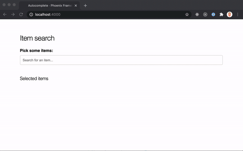
The leex template is still missing. We use a basic input field inside a form tag. The suggestions will be displayed inside an unordered list ul with each item being represented by a li element (I know, the items should probably be a button for accessability, but for know, we do not do that 😜).
The suggestion list should only be displayed when the user focuses the field and if we have any results based on the search term.
I will omit the CSS inside this post as it’s only boilerplate. You can look up the CSS classes here.
<div class="container">
  <h2>Item search</h2>

  <script>
    // we add a global autocomplete function
    // which will handle our client-side logic.
    // we extend this later on...
    function autocomplete() {
      return {
        isOpen: false,
        open() { this.isOpen = true; }
        close() { this.isOpen = false; }
      }
    }
  </script>

  <div
    class="autocomplete"
    x-data="autocomplete()"
    @click.away="close"
  >
    <form phx-submit="submit" phx-change="suggest">
      <div>
        <label for="search">
          Pick some items:
        </label>
        <input
          id="search-input"
          name="search"
          type="text"
          x-on:focus="open"
          phx-debounce="300"
          placeholder="Search for an item..."
        />
      </div>

      <div class="suggestions">
        <%= if Enum.any?(@suggestions) do %>
        <ul
          id="autocomplete-suggestions"
          x-show="isOpen"
          x-ref="suggestions"
        >
          <%= for {item, index} <- Enum.with_index(@suggestions) do %>
          <li
            id="item-<%= index %>"
            x-ref="item-<%= index %>"
            phx-click="select"
            phx-value-id="<%= item.id %>"
            class="item"
          >
            <img src="<%= item.image_url %>" />
            <span>
              <%= item.name %>
            </span>
          </li>
          <% end %>
        </ul>
        <% end %>
      </div>
    </form>
  </div>

  <div>
    <h4>Selected items</h4>

    <div class="selected">
      <%= if Enum.any?(@selected) do %>
      <ul>
        <%= for {item, index} <- Enum.with_index(@selected) do %>
        <li id="selected-item-<%= index %>" class="item">
          <img src="<%= item.image_url %>" />
          <span>
            <%= item.name %>
          </span>
        </li>
        <% end %>
      </ul>
      <% end %>
    </div>
  </div>
</div>
This template contains a mixture of Alpine.js code and embedded Elixir. We do not want to track the open / close state of the suggestions popup on the server. This is handled by alpine using the autocomplete function. We bind this using the x-data="autocomplete()" attribute on the autocomplete container. We want to close the popup when the user clicks anywhere outside of our autocomplete field — that’s what the @click.away="close" does.
Moving further down, the suggestions container will be rendered when there are any suggestions are available (we did set-up this in mount before). Also it controls the visibility by x-show="isOpen".
We then iterate over all suggestions using the for comprehension to display all suggestions inside the list. LiveView requires us to assign each element an id so it can reference to it based on changes made by the server.
To make the items selectable, we need to add some LiveView event attributes. That’s what phx-change="suggest" andphx-click="select". To prevent form submits (e.g. when the user hits the Enter key), we also need handle the submit event by adding phx-submit="submit".
The container second part displays all the selected items and should be pretty self explanatory.
To handle the events on the server, we add the according handle_event functions in our AutocompleteLive module.
def handle_event("suggest", %{"search" => search}, socket) do
  suggestions = Items.list_items() |> suggest(search)

  {:noreply, assign(socket, suggestions: suggestions)}
end

defp suggest(items, search) do
  Enum.filter(items, fn i ->
    i.name
    |> String.downcase()
    |> String.contains?(String.downcase(search))
  end)
end
The handle_event function pattern matches on the search string which is sent via the phx_change event we added earlier. It then fetches all items from the Itemsmodule and filters the result using the suggest function. The suggest function performs a simple case insensitive search.
Next, we should handle the select event.
def handle_event("select", %{"id" => id}, socket) do
  item = Items.get_item(id)
  selected = Enum.uniq_by([item] ++ socket.assigns.selected, & &1.id)
  suggestions = filter_selected(socket.assigns.suggestions, selected)

  socket =
    assign(socket,
      selected: selected,
      suggestions: suggestions
    )

  {:noreply, socket}
end

defp filter_selected(items, selected) do
  Enum.filter(items, fn i -> !Enum.any?(selected, fn s -> i.id == s.id end) end)
end
Again, we pattern match on the params (in this case id) and fetch the selected item from the Items module. To populate the list of all selected items we repend the new item to the list of the existing selected items. Additionally, we make sure that no duplicates are being added by callingEnum.uniq_by.
We do not want the suggestions to contain any of the selected items. Therefore we create a filter_selected/2 function, which removes any existing item from the given items which are contained in the second argument — based on it’s id.
As mentioned earlier, the submit event does need to be handled in order to prevent the default submit behaviour when the user hits the Enter key. That’s as simple as adding a handle_event callback and simply return the socket.
def handle_event("submit", params, socket), do: {:noreply, socket}That’s it. We should now have a working prototype that allows us to search for items and select them with a click. Awesome! 🎉
…but it’s not very pretty yet, isn’t it? There is still something we can improve:
- show a proper highlight when the user hovers with the mouse
- navigate via Up- and Downarrow keys
- select an item by hitting the Enter key
That’s what we are going to do next.
Make it pretty — improve the UX.
Lets start with the most simple thing first: show a proper highlight when the user hovers with the mouse over it.
We want to handle the selection directly on the client and not on the server as this is a pure client-side thing. In order to make the keyboard navigation happen at a later point, we cannot rely on CSS classes here and have to manage our own hover / focus state.
Adding a focus on mouse-over is really simple:
<script>
  function autocomplete() {
    return {
      // ...
      focus: 0,
      setFocus(f) {
        this.focus = f;
      },

      // ...
    }
  }
</script>

<!--
  Add the following two attributes to the <li> suggestion item
-->
<li
  @mouseenter="setFocus(<%= index %>)"
  :class="{ 'focus': focus === <%= index %> }"
/>
By adding a focus property on our autocomplete function we can rely on this to apply the according class to the suggestion item. The@mouseenter attribute will take care of setting the correct focus as soon as the mouse moves over the suggestion.
That’s neat. Now we are going to add keyboard support.
<script>
  function autocomplete() {
    return {
      // ...

      scrollTo(idx) {
        this.$refs[`item-${idx}`]?.scrollIntoView(false);
      },
      focusNext() {
        const nextIndex = this.focus + 1;
        const total = this.$refs.suggestions?.childElementCount ?? 0;
        if (this.isOpen && nextIndex < total) {
          this.setFocus(nextIndex)
          this.scrollTo(nextIndex);
        }
      },
      focusPrev() {
        const nextIndex = this.focus - 1;
        if (this.isOpen && nextIndex >= 0) {
          this.setFocus(nextIndex);
          this.scrollTo(nextIndex);
        }
      },

      // ...
    }
  }
</script>
<!--
  add the following attributes to the
  autocomplete div container
-->
<div
  x-on:keydown.arrow-up="focusPrev"
  x-on:keydown.arrow-down="focusNext"
/>
Adding keyboard support is achieved by adding three new functions for managing the focus state to the autocomplete function.
scrollTo(idx): Scrolls to the given index by using Alpin.js $refs object. If the ref does exist, it calls scrollIntoView(false) on the element. This will scroll the focused item into the view without any animation.
focusNext(): Sets the focus to the next element if the suggestion box is visible and the next element index is smaller than the total amount of suggestions and scrolls it into the view.
focusPrev(): Sets the focus to the previous element if the previous index is not smaller than 0 and scrolls it into the view.
Then we wire up the autocomplete container div with the two event attributes for arrow-up and arrow-down.
Next up: select the current suggestion by hitting Enter:
<script>
  function autocomplete() {
    return {
      // ...

      select() {
        this.$refs[`item-${this.focus}`]?.click();
        this.focusPrev();
      },

      // ...
    }
  }
</script>
<!--
  add the following attribute to
  the autocomplete container div
-->
<div x-on:keydown.enter="select()" />
That’s simple, too. The only thing I am not a hundred percent satisfied with, is that we need to rely on a $ref and manually need to trigger the click event on the suggestion. I didn’t find any official api yet. It is currently only supported within the scope of a Hook, but this does seem to make things more complicated in this case. Maybe there will be a public api for pushing events to the server outside the hook scope. For now, this is an acceptable workaround.
If you have a better idea here I’d be happy if you could leave a comment or send me a message on twitter @benvp_.
That’s it. We made it! We managed to create a fully functional autocomplete with a custom suggestion list in about 140 LOC including server-side code.
Honestly, I think this is a great achievement if you compare this to the effort of implementing the same with a client-side framework like React and talking to a separate API. If you take this a step further and consider for example validations this is a huge timesaver. I’m excited for the future of LiveView and Elixir.
Cheers, Ben.